Comfort and Content Placement
Visual Comfort
Visual comfort depends on several things:
Device fit quality
Users should complete the Custom Fit application to ensure optimal performance and visual comfort. See Headset Fit for more information.
Content placement relative to the user
Visual discomfort may occur when content is presented too close to the user. (See Display Zone for more information). For optimal visual comfort, it is recommended to keep the content close to the focal plane (0.74m). However, if the user has completed Custom Fit, content will be comfortable for most people as long as it is further than the default near boundary of the Display Zone (0.37m). The Display Zone near boundary is also called the near clipping plane.
Stationary vs Moving content
Visual discomfort may occur when content is in motion, especially when moving in the Z axis (i.e. forward/backward). To minimize discomfort, design content so that users don’t need to spend long periods of time viewing movement, especially in the Z axis.
The user’s movement
Many users unknowingly move or bob their head or body. Account for this minimal movement when designing buffers in the UI behavior. For better legibility, faster content recognition, and fewer false positives, allow for content to be less rigid, e.g.; content rotates to face the user and allows small adjustments in height without UI reaction.
Visual Effects
Certain visual effects may cause discomfort for users. Effects like lense-distortion, chromatic aberration, and depth of field may disorient users and give a sense of distorted vision.
Display Zone
The default Display Zone near boundary (near clipping plane) is set to 0.37m in order to prevent content from appearing too close to the user. The Display Zone far boundary is set to 10m for rendering optimization.
For user safety, viewing content any closer than 0.37m is not advisable as it may cause user discomfort, vision blurriness, double vision, and nausea. To learn more about this topic and how to build apps that properly use the Display Zone, see the Display Zone and Clipping Planes article.
Optimal Content Placement Area
Design with the 30°x30° Optimal Content Placement Area in mind.
The Optimal Content Placement Area (OCPA) is a 30°x30° boundary within which content is visible to users at all times, without moving their head. Users will rotate their eyes up to 15° after which they will move their head to view content. Refer to the figure below.
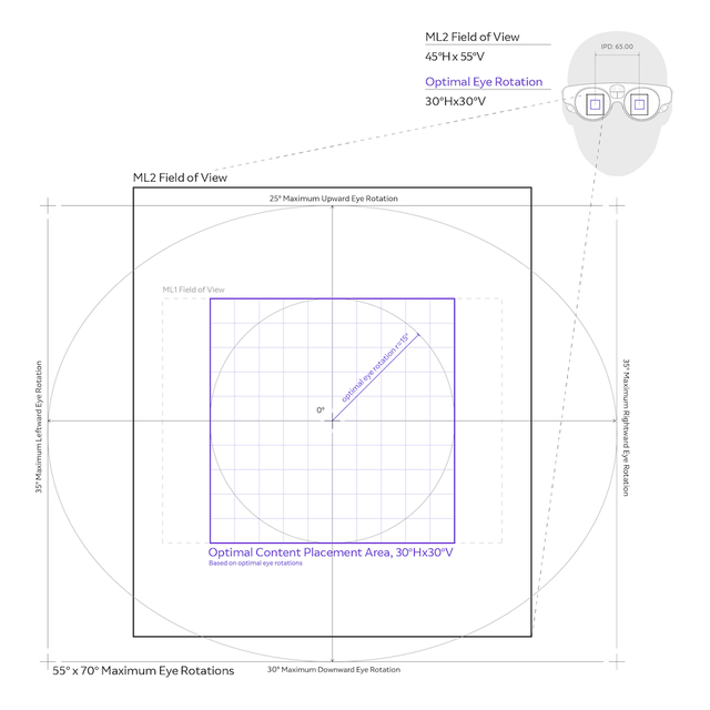
Place essential content within the OCPA and around the user’s line of sight, avoiding the top, bottom, and corners of the FOV.
Essential content, such as important warnings or any content that needs to be visible to the user at all times, should be placed within the OCPA. Placement of content that needs to be frequently interacted with outside the OCPA will necessitate frequent diagonal and upward vertical head movements, interactions and may cause discomfort. There are however some situations in which content can be placed outside the OCPA if done intentionally e.g. if the content is non-essential and peripheral.
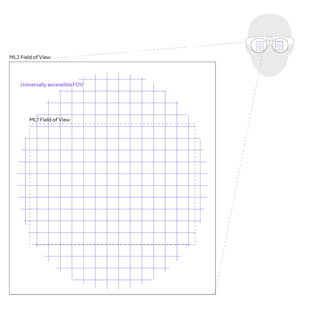
For users to be able to see the biggest portion of display FOV possible, the Headset Fit is crucial and users should have completed the Custom Fit.
However, due to significant facial size and shape variance, every individual will not have a similar virtual FOV visible. The figure below illustrates the worst case FOV of all users in a good Headset Fit. Notice that the corners and edges of the FOV are blurry or not visible. Consider this when designing content placement, especially for head-relative content. See Headset Fit for more information.
See below the image of the virtual display FOV of a worst-case scenario user that has completed Custom Fit (Vertical: 49°/55°; Horizontal: 41°/45°; Diagonal: 51°/71°)
Center the FOV at or slightly below the natural line of sight.
A person’s natural line of sight slopes slightly downwards, approximately 10-15° below the horizon. Magic Leap 2 has been designed to be tilted (pitched) downwards around approximately 10° with the back of the headset lifted above the ears to account for the downwards line of sight. User testing has found that users, when allowed to tilt (pitch) at a comfortable angle, typically tilt (pitch) the device at 6°± 10°.
Interaction Ergonomics
When determining placement of content relative to the user, such as whether users will use hand gestures or the controller to provide input. To ensure comfort, the placement (or position) of the content should be adjustable by the user in all cases.
Hand Gesture Input
For detailed information on designing interaction for hand gesture input, see the Hand tracking design guide.
Controller Input
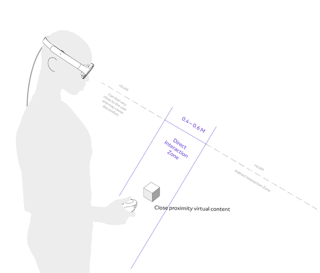
For direct inputs with the controller (direct inputs with controller = when controller is used to directly manipulate objects, i.e., controller itself is used to “grab” objects that are at arms reach, as opposed to the controller’s ray), place content within arms' reach, between 0.m4-0.6m. The most comfortable placement will be at the lower end of this range.
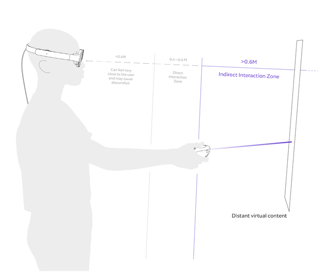
For indirect inputs with the controller (indirect inputs with controller = when controller’s ray is used to manipulate objects, i.e., controller’s ray is used to “grab” objects that are at a distance), place content beyond 0.6m, preferably between 0.8m to 1.5m away.
Design content that doesn’t require users to raise their arms frequently or for long periods of time
Ideal user experience allows for the elbow to remain relaxed (i.e. upper arm resting vertically and elbow bent at a 50-90° angle) and shoulders unflexed. The further out the arms have to reach to interact with content, the more fatigue the user will experience. Interacting using gestures with the arms outstretched for even a few minutes is fatiguing, and research shows that 12 minutes were found to be unbearable where only 25% of users were able to complete a single 30 minute session - a fraction of the time knowledge workers spend in one sitting (study link). To guide content placement, see below for reach measurements.
The reach distance for unflexed shoulders is 0.40m. Content that users are directly interacting with should never be placed farther than the fully-stretched arm at 0.75m (MIL-STD-1472, 2012).
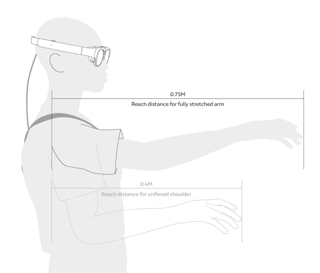
Note that the measurements presented in the figure above are the 5th percentile of females in order to accommodate users with the smallest reach dimensions (i.e. 5% of the smallest female arms should be able to reach the content). All measurements are from a North American population. Note that anthropometry varies by gender and ethnicity.
UI Behavior
When designing behaviors, keep in mind how and where the user may move.
What are the real-world factors, obstructions, and environment that will dictate behavior? Will they remain in one area or will they be working across multiple rooms? Will they be sitting at a desk, walking around, or both? If the user is in a factory or warehouse, does the user need to be aware of dangerous machinery and real-world visual and audio cues? Or will they need to interact with other coworkers while wearing the device? Is the digital content large with the potential to block large portions of the user’s view? Behaviors are the primary way to accommodate for these conditions, and being mindful of them is the difference between a good and bad user experience.
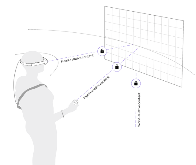
There are different types UI behaviors that can be used
- Head-relative follows movement and positioning based on the user’s head position.
- Body-relative follows movement and positioning based on the user’s body position.
- World-relative is attached to environments or real-world objects and relies on spatial anchors.
- Input-relative maintains persistent x, y, z coordinates from an input system such as the user’s hand or controller.
Head-Relative
Head-relative content follows movement and positioning based on the user’s head position, and remains at a consistent height and distance from the head. Use head-relative behavior with caution, as it may obstruct the environment and cause discomfort.
Use head-relative behavior:
- To interrupt a user’s workflow, and get their full focus and attention, e.g. notifications.
- For content that needs to be constantly present in the user’s view, e.g. privacy indicators.
Do not use head-relative behavior:
- If content is large, as this will obstruct the user’s view of the environment or of other content and may put the user in a dangerous situation by obstructing their view of real-world hazards. Use body-relative or world-relative behaviors instead, as they allow the user to view past large digital UI obstructions.
- If content is large in combination with dimming, which already obstructs the real world.
- For long blocks of text, as people naturally turn to read text. Attaching text 1:1 to head position makes for an awkward reading experience. Use body-relative or world-relative behaviors instead, as they offer more forgiveness of natural body swaying movements.
- Content that moves 1:1 with the user's head movement, especially for content that needs to be targeted and interacted with.
When using head-relative behavior
Consider setting corresponding audio files to 2D versus spatial rendering. Spatial audio may disorient the user. Use head-relative behavior with caution, especially with large content. Consider placing non-essential head-relative content in the top of the FOV, e.g. system privacy indicators.
Body-Relative
Body-relative content follows movement and positioning based on the user’s body position. Content spawns directly in front of the user, but when the user looks to the right, for instance, the content stays in place and does not block the user’s view. If the user wishes to reacquire the content, they can look back to the left or utilize any or all of the controller buttons, except the Home button, to re-center the content in front of the user. The content remains a certain distance from the user, and it may follow them as they move across a room. It is always easily accessible, but it does not demand attention when real-world interaction or attention may be more important.
Use body-relative behavior:
- For suggested user focus and passive attention, e.g. home menu. Body-Relative content won’t interrupt a user’s workflow to the same extent that head-relative content will.
- When the user is moving, e.g. Remote Assist applications.
- For larger content; Body-relative content won’t obstruct the real-world and other content to the same extent that head-relative content will.
When using body-relative behavior:
- Take into account the likelihood of a user sitting and standing up. We recommend height-adjusting body-relative content by implementing a vertical lazy follow adjustment. The level of follow adjustment (e.g. The distance/rotation that the user needs to surpass from the content for it to move) will differ depending on the size of the content and spawning distance from the user.
- Consider that users may feel like they “lose” body-relative content when the task involves walking around and turning frequently, since body-relative content will in these cases often appear behind the user.
World-Relative
World-relative content is attached to environments or real-world objects and relies on spatial anchors.
Use world-relative behavior:
- When content is contextual to something or some place in the environment and should be placed relative to it, e.g. a menu or map is placed on top of a table surface, near a specific entryway or exit, or against a wall.
- When the user won’t need access to the content when moving between rooms.
Do not use world-relative behavior:
- When the user is expected to move around and still need access to the content. Content could be obstructed by walls, especially in smaller spaces or when the user moves a lot.
When using world-relative behavior:
- For remote (non-collocated) shared experiences, world-relative content for one user may be obstructed, inaccessible, or misaligned for other users.
Input-Relative
Input-relative content maintains persistent x, y, z coordinates from an input system such as the user’s hand or controller.
Use input-relative behavior:
- For controller tooltips or gesture feedback. Be sure to test font sizes.
Do not use input-relative behavior:
- For small blocks of text, since the user will have to steady their head and hand to read them.
How to mitigate user micro-movements
Use a buffer for content to mitigate natural micro-movements while reacting to macro-movements.
- Users are never completely stationary, they sway, lean in or out, tilt their head and fidget.
- When a user interacts with content using a controller or gestures, this is compounded by shoulder, elbow and hand movement.
- The content needs to remain stationary so a user may read instructions or menu options, but still allow for macro-movements like standing up or walking across a room.
It is recommended that content have a buffer that mitigates these natural micro-movements while reacting to macro-movements. Utilize buffers to keep content stationary up to a set threshold so users can read and interact, and only move content when the buffer parameter is breached in the case of macro-movements.
Magic Leap System Content
Test your content to make sure it doesn’t conflict with system overlays.
If enabled, system overlays like system notifications, system voice command UI, and privacy indicator UI may appear within your application.
Privacy Indicators
- Spawn at a distance of 0.78m.
- Use a head-relative behavior that has a tight follow with minimal movement buffer. This utilizes tight movement because no interaction is available, and to set it apart from all other UI.
Notifications
- Spawn at a distance of 0.9m.
- Use a head-relative lazy tether behavior because they are small, set high in the FOV, and don’t block much of the outside world.
Dialogues
- Spawn at a distance of 0.9m.
- Use body-relative behavior because they often take up a large portion of the FOV, putting users at risk if they need to view and react to real-world occurrences.
Home
- Although the Magic Leap 2 Home menu will not appear within your application, it is a rigorously tested feature, with behaviors, size and distance that can serve as reference for your application’s design.
- Spawns at a distance of 1.1m (with a minimum distance of 0.7m and maximum 1.3 meters)
- Uses a body-relative behavior, rather than head or world-relative, to minimize obstruction of the user’s real-world view.
Content size, distance and visual angle
Visual angle (i.e. angular degrees) is a good way of representing the size of content because it stays constant irrespective of viewing distance. The relationship between content size (Size), viewing distance (ViewingDistance), and visual angle (i.e. AngularDegrees) is represented by the following:
AngularDegrees = 2 atan (Size / (2 ViewingDistance))
Size = 2 ViewingDistance tan (AngularDegrees/2)
You can also use the online calculator here: https://www.1728.org/angsize.htm
Rendering Rates
Render content at a recommended minimum of 60 frames per second (FPS)
Keeping frame rate consistent is important. The human visual system may perceive the display as flickering rather than as a stable visual display and cause discomfort if content is rendered at a rate lower than 60 FPS. Any frame rate lower than 60 FPS requires the time-warp feature to compensate for head-pose degradation. Targeting a faster frame rate of 120 FPS is recommended to reduce motion sickness.